Page 1 of 1

My take on base system cards.

PostPosted: March 9th, 2020, 8:32 pm
by matrice666
I came across a copy of the base systeme a while ago... for free! Well it had some cards missing and all of the minis are Ah-gone.

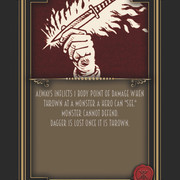
THEREFORE... i took onto myself to remake some cards using the MPC website... 2nd problem... i think heroquest cards are dated.
The art looks good but the overall look of them ... eeeeeeh, no.

So here's my take on them...
Notice: monsters art is from images i found online and reworked.

Comments are welcome.

https://drive.google.com/open?id=1sY7-Y ... PtLCKhhcrO

Re: My take on base system cards.

PostPosted: March 9th, 2020, 9:28 pm
by DullandRusty
Nice! I like the old and new feels merging. While i opted for a complete modern style in color for my homebrew cards (with lots of other expanded cards), I like what you did.

Re: My take on base system cards.

PostPosted: March 10th, 2020, 12:31 pm
by matrice666
DullandRusty wrote:Nice! I like the old and new feels merging. While i opted for a complete modern style in color for my homebrew cards (with lots of other expanded cards), I like what you did.


Hey thanks man!

Re: My take on base system cards.

PostPosted: March 10th, 2020, 2:26 pm
by lestodante
Well, I don't think the HQ style of the cards are dated, so I see any reason why I should change it. I prefer it to any modern PC style we can find in other games or remake.
But of course it is just a matter of tastes.
From your layout I think I would change that red/brown ink from the images to match with that senape of the bottom part so the two styles will merge better in my opinion (I attach an example below, although the color is not really the same in my try).
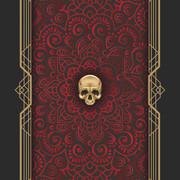
Also the back of the cards are all very similar, changing only the color and the small icon at the centre.
The font used is not really clean, I would apply one that is readable easier.

card 1.jpg

Re: My take on base system cards.

PostPosted: March 10th, 2020, 3:50 pm
by matrice666
lestodante wrote:Well, I don't think the HQ style of the cards are dated, so I see any reason why I should change it. I prefer it to any modern PC style we can find in other games or remake.
But of course it is just a matter of tastes.
From your layout I think I would change that red/brown ink from the images to match with that senape of the bottom part so the two styles will merge better in my opinion (I attach an example below, although the color is not really the same in my try).
Also the back of the cards are all very similar, changing only the color and the small icon at the centre.
The font used is not really clean, I would apply one that is readable easier.

card 1.jpg


Thank you for your input! i did play around with the color of the drawings. It just seems that trying to match the color of the border makes the card really flat.

As for the back icon. The spells are similar yes, monster, artifacts and treasures are all different colors with very different logos.
Do you still think they're too similar?

lastly, I do agree about the font. I tried to go with something Art Deco, matching the frame style... but if you have any suggestions, Im open!

I included 2 styles of artificats from the KK extension.


Image ImageImage Image Image
Image Image ImageImageImage

Re: My take on base system cards.

PostPosted: March 10th, 2020, 4:40 pm
by lestodante
Did you think to color the artwork too? Someone did a color version of the cards too. I know is a lot of work to do but the result is very nice.
For the backs, yes, I still think they are very close, as the artwork used is the same for all of them but with different colors and logos.
I am a fan of the colorful original artworks but as I told before it is just a matter of tastes. If this design matches your tastes better they are good!
For the font it seems there is some kind of grey glow effect around the text that makes it not easy to read. Maybe a bolder font will be more visible even with the same effect on it.