Looking for inspiration…
 Posted: August 6th, 2022, 2:53 am
I'm looking for some inspiration (thanks for the d20, but that's a different game) for a new logo for YeOldeInn. The one we have uses the HeroQuest trademark and it probably shouldn't. We're probably not gonna get a "you need to change it, now" because nothing about the site is commercial, but it seems like the site has a trademark of its own that would be perfect fodder for a logo:

Doesn't get much better than that, does it?
So trawled teh intarwebs for something similar. Didn't find anything close, but I'll share what I found.

Well the artist who came up with that one is clearly male …

That's cool.

hm.
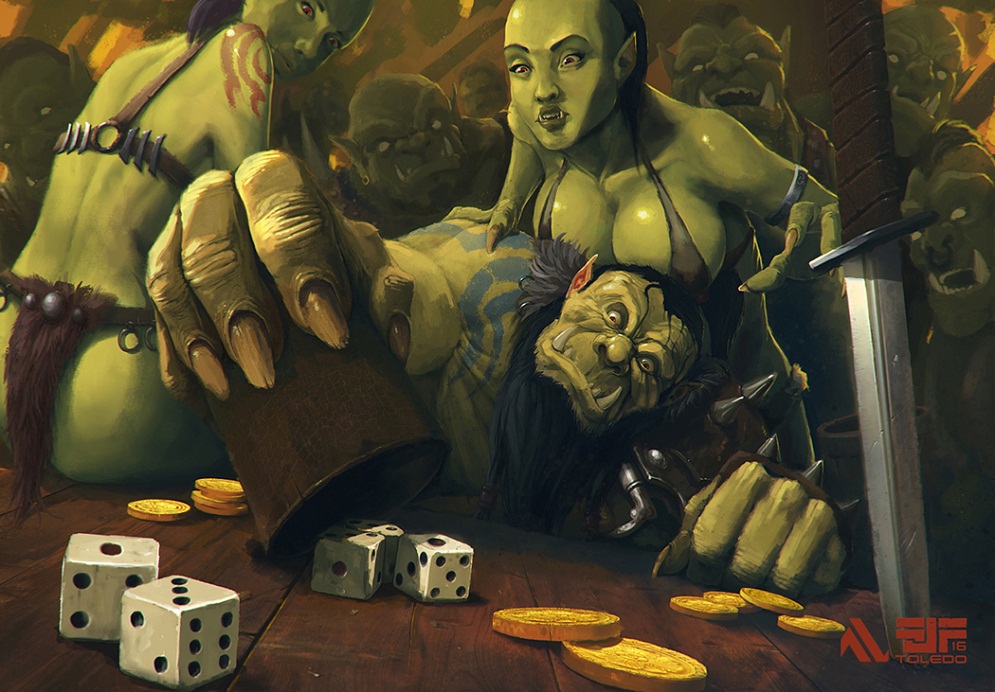

That one is here. It's also the first one of these that makes orcs (at least the men) not be just "green human". I mean, the female orcs are all very "human-looking" because but still.
I don't find many orc bar patrons drinking. The one I found that was the closest (and it wasn't) to to the spirit of our was a link that was 404, boo! I was definitely hoping to find something more like the classic cards ink/pen style and definitely more the oldhammer-style classic HQ grinning orc. He's just happy to be here… Have a drink, laugh, maybe smash something later … basically a fun night.
I mean I can't draw my way out of a paper bag, so whatever I find, I'd need to find someone to take the time to draw it for us.
Other suggestions? It's gonna go with a completely new site anyway so it doesn't have to look like anything we have now.
Doesn't get much better than that, does it?
So trawled teh intarwebs for something similar. Didn't find anything close, but I'll share what I found.
Well the artist who came up with that one is clearly male …
That's cool.
hm.
That one is here. It's also the first one of these that makes orcs (at least the men) not be just "green human". I mean, the female orcs are all very "human-looking" because
but still.I don't find many orc bar patrons drinking. The one I found that was the closest (and it wasn't) to to the spirit of our
was a link that was 404, boo! I was definitely hoping to find something more like the classic cards ink/pen style and definitely more the oldhammer-style classic HQ grinning orc. He's just happy to be here… Have a drink, laugh, maybe smash something later … basically a fun night. I mean I can't draw my way out of a paper bag, so whatever I find, I'd need to find someone to take the time to draw it for us.
Other suggestions? It's gonna go with a completely new site anyway so it doesn't have to look like anything we have now.

